After a lot of development we decided on a logo design which was both simple and effective but also versatile which gave us the chance to alter it according to each different course.
Final Logo Design
Final Logo Design

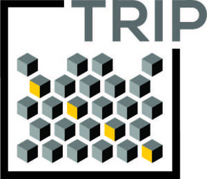
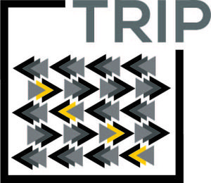
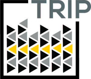
The logo represents our concept of estranging the visitor into another world of art and music. It also symbolizes the journey (trip) that the visitors are going to have when visiting the exhibition. Also the design was based on a square (cube) since this was the core of our concept.

Since the idea of our concept originated from the rubik’s cube, we decided to work our logo on the base grid of a rubik’s cube. More guides where added to the grid so that to be able to formulate the idea we had for the logo.
As we creating different geometric patterns for each course using simple space together with white space, we wanted to include bits of the pattern into the logo so as each course would have a unique logo that identifies it.
Logo Variations
Logo Variations
| 
| 
|
