
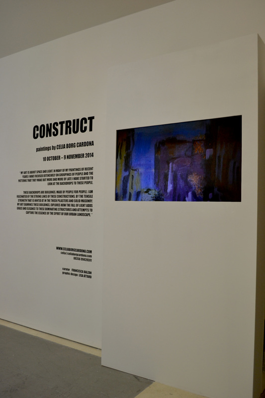
Construct presents a collection of paintings by Celia Borg Cardona which are exhibited at St James Cavalier. In this collection of paintings Celia Borg Cardona has focused on architectural views from different Maltese Towns, spreading her work on different sizes of canvases.
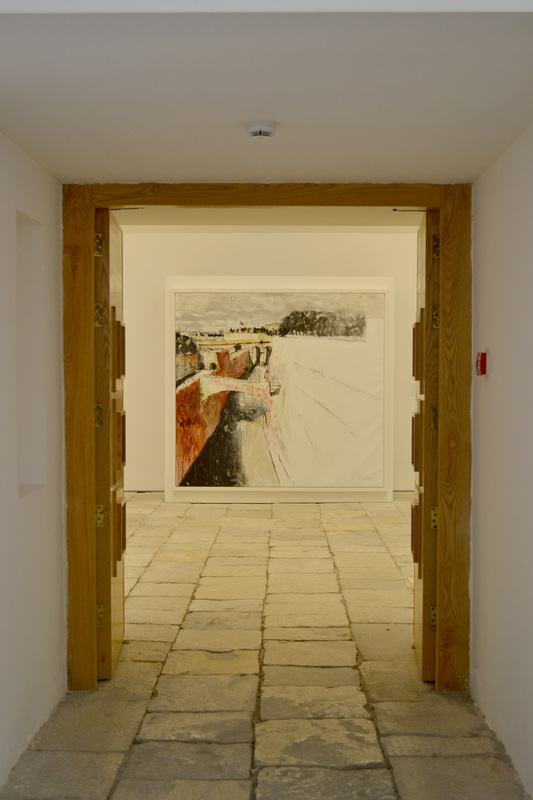
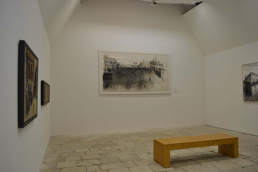
The space which was assigned to this exhibition is very spacious and is divided in different rooms, thus the paintings are spread between these rooms which makes it easy to go around and observe the exhibition. Since the exhibition is made up of paintings, only the walls of the space are occupied so there is plenty of free space for people to move around thus the flow of navigation is straight forward since there is a main corridor that links all the rooms together.
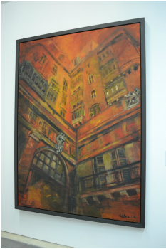
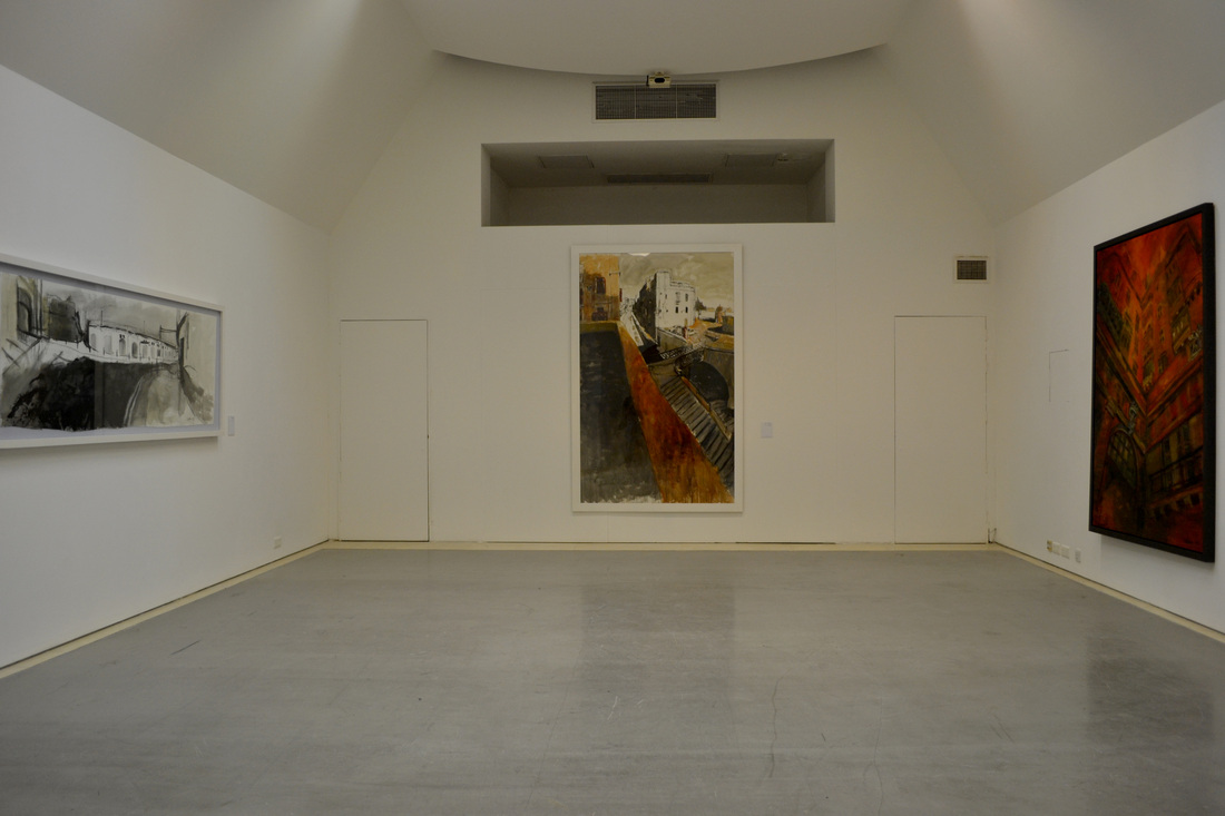 One of the main rooms of the exhibition | 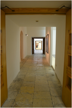 |
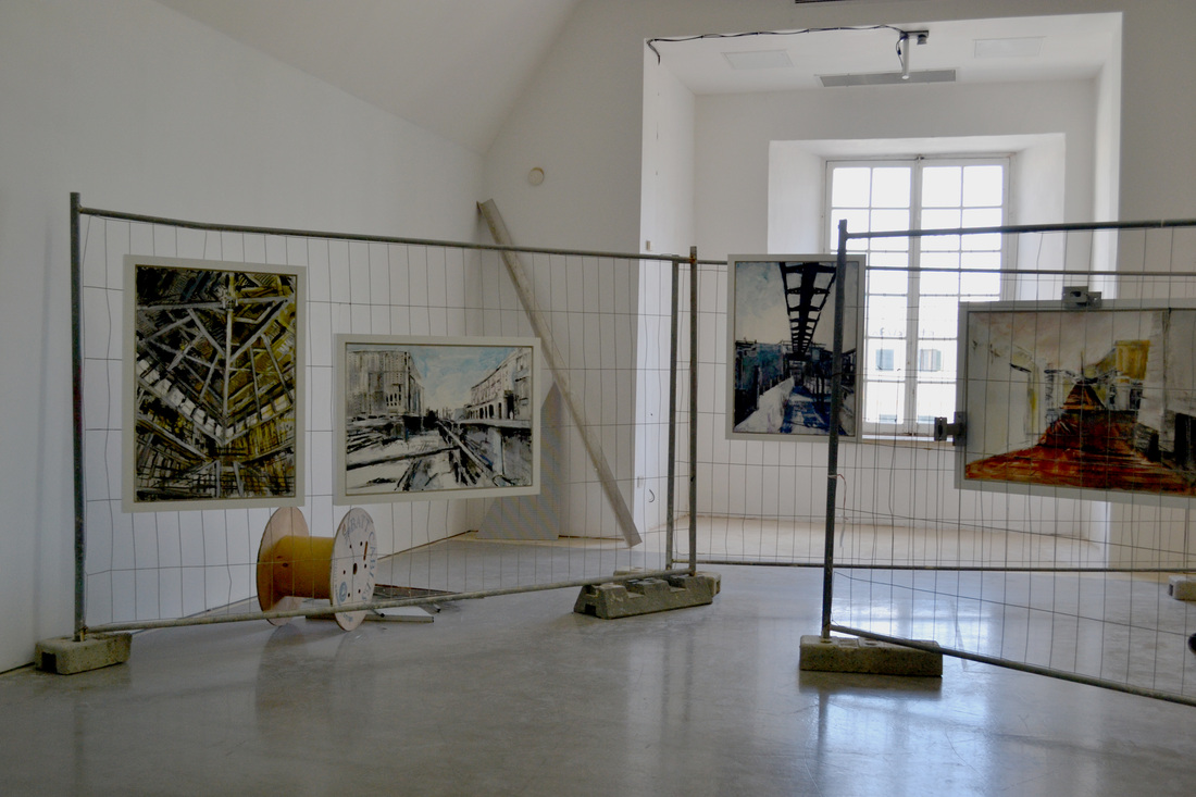
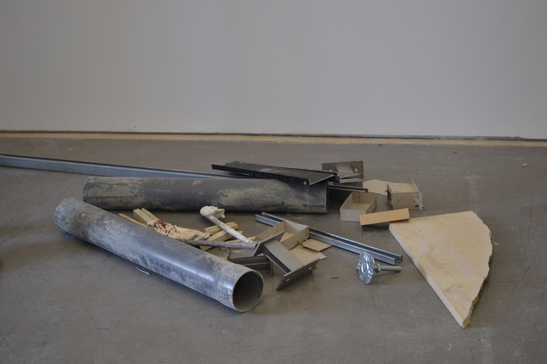
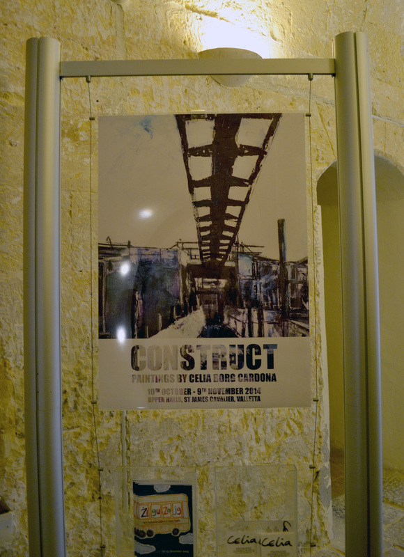
The setting of the space is very minimalistic and clean, however, there was a particular room in which the paintings either than just hanging on the wall where displayed on a fence which is generally found in construction places, together with some broken materials that are also usually found in construction places, however, this added up to the visuals of the exhibition rather than just being used as props.
 |  |
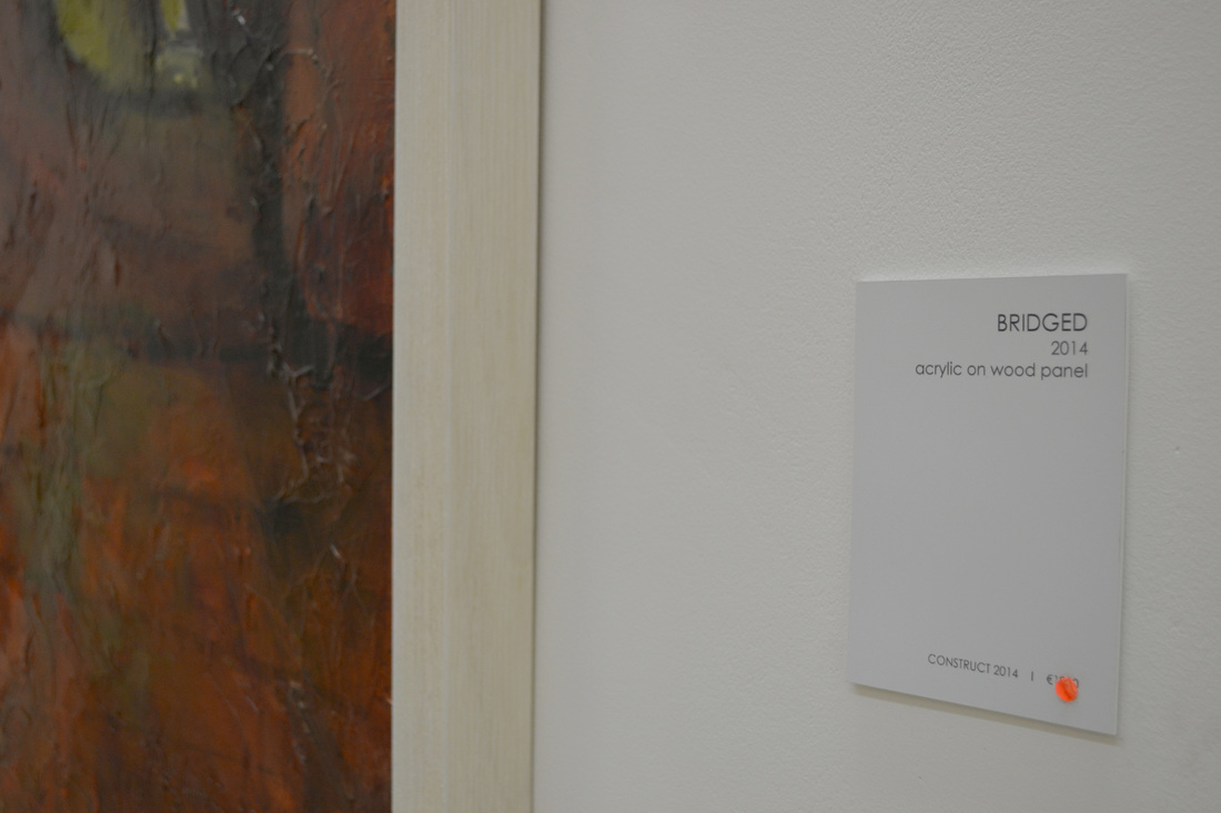
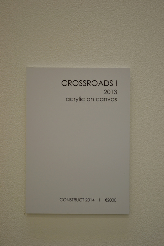
When it comes to labelling of the paintings, each painting was equipped with a plaque next to it stating the name of the painting, the year, the medium that was used for it and also the value of the painting. The typography chosen is a sans serif type which apart from being easy to read, it complements the overall look of the exhibition. The only thing that could be improved about the plaques is the reading heights. As they are adjusted according to the size and position of the paintings some of them are a bit too low as they are supposed to be hanged at an average eye-level. Apart from the plaques, the only typography present at the exhibition was a paragraph describing the exhibition and the exhibit at the entrance of the exhibition which was displayed in a bold, sans-serif font, and as it was stuck on the wall it made an interesting effect to the room.
 |  |
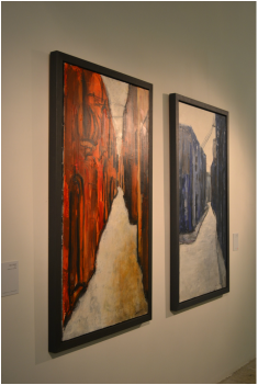
The colour palette used throughout the exhibition focuses on whites, greys, blacks and occasionally touches of red, blue or yellow are used along with the other. However, in some paintings the red, blue or yellow are more dominant than the other three. I think that the chosen palette helps reflect the theme of the exhibition and succeeds in creating interesting effects which attracts the viewer.
Through elements such as the colour palette, the typography used, the theme of the exhibition and its setting, it succeeds in creating a holistic environment. The paintings almost create an illusion that they all link to each other and that's what made my visit interesting, because its almost like you haven't seen anything if you don't analyse every painting. The setting in which they are placed plays an important role in achieving the unity of the elements exhibited.
The brand used has a visual style that anticipates what you are going to see in the exhibition, however, it doesn't give it all, so you are encouraged to go view the exhibition. By concentrating on a particular theme, that of construction in this instance, helps create a more specific visual style and brand for the exhibition which in my opinion makes more impact on the viewer. It also helps the exhibit to communicate the desired message to the viewers.
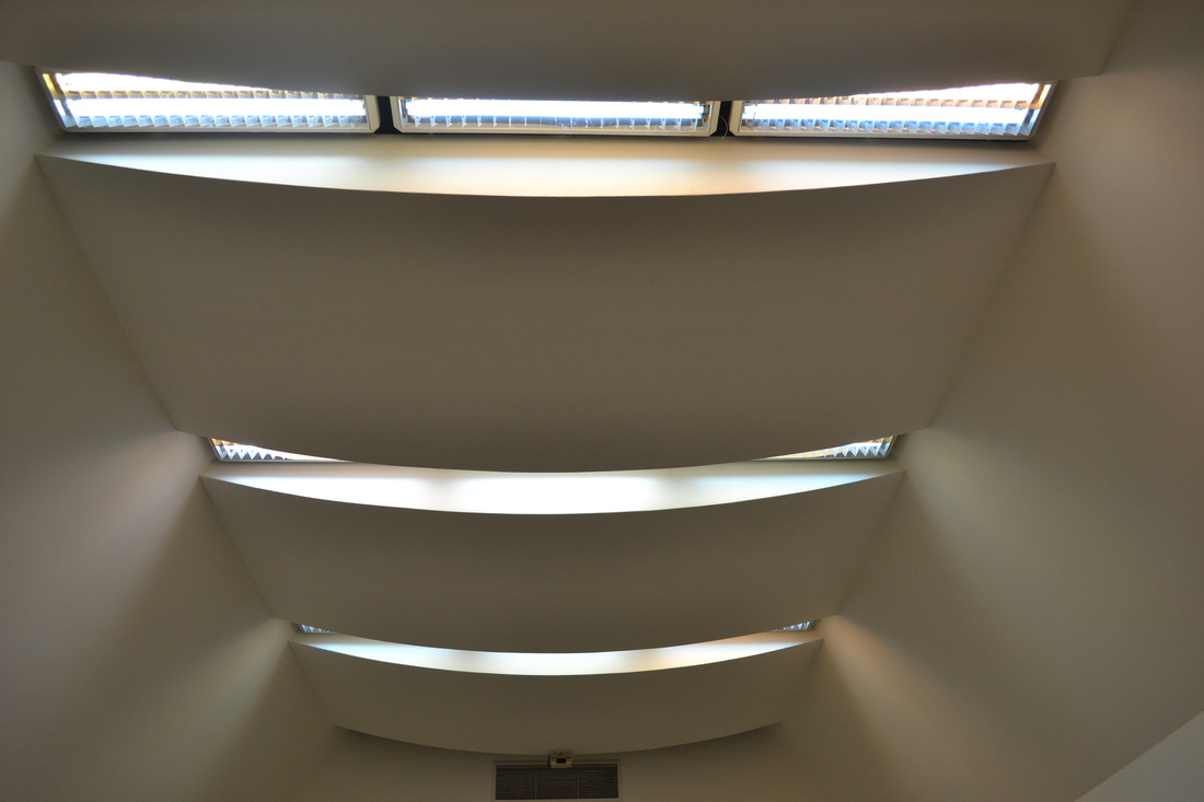
Although this exhibition hadn't any interactive elements combined with the whole experience it offers, it succeeds in engaging the viewers, not only art lovers, to follow the story that the exhibit has to tell. She makes her art be appreciated by all audiences and in fact almost all the paintings in the exhibition where already sold. A particular atmosphere is achieved through the lightning used, the setting of the paintings and the overall look of the exhibition space which create an engaging experience to the different audiences it achieves.
Through elements such as the colour palette, the typography used, the theme of the exhibition and its setting, it succeeds in creating a holistic environment. The paintings almost create an illusion that they all link to each other and that's what made my visit interesting, because its almost like you haven't seen anything if you don't analyse every painting. The setting in which they are placed plays an important role in achieving the unity of the elements exhibited.
The brand used has a visual style that anticipates what you are going to see in the exhibition, however, it doesn't give it all, so you are encouraged to go view the exhibition. By concentrating on a particular theme, that of construction in this instance, helps create a more specific visual style and brand for the exhibition which in my opinion makes more impact on the viewer. It also helps the exhibit to communicate the desired message to the viewers.
Although this exhibition hadn't any interactive elements combined with the whole experience it offers, it succeeds in engaging the viewers, not only art lovers, to follow the story that the exhibit has to tell. She makes her art be appreciated by all audiences and in fact almost all the paintings in the exhibition where already sold. A particular atmosphere is achieved through the lightning used, the setting of the paintings and the overall look of the exhibition space which create an engaging experience to the different audiences it achieves.

 |  |
