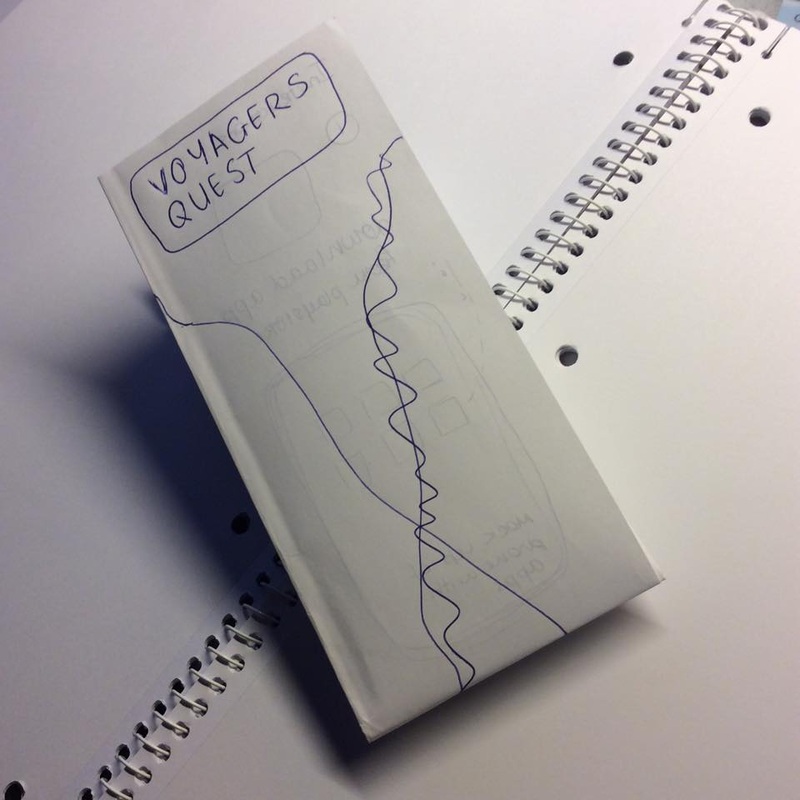
Steph had started designing the brochure that would represent how the app works, however, I did not like it as it didn't look that professional. Based on her idea I tried to come up with something more professional looking and maybe easier to follow.
I tried out the folds on a piece of paper and sketched the placement of the content onto it so that to have a clearer idea of how it will look like.
I tried out the folds on a piece of paper and sketched the placement of the content onto it so that to have a clearer idea of how it will look like.
  | 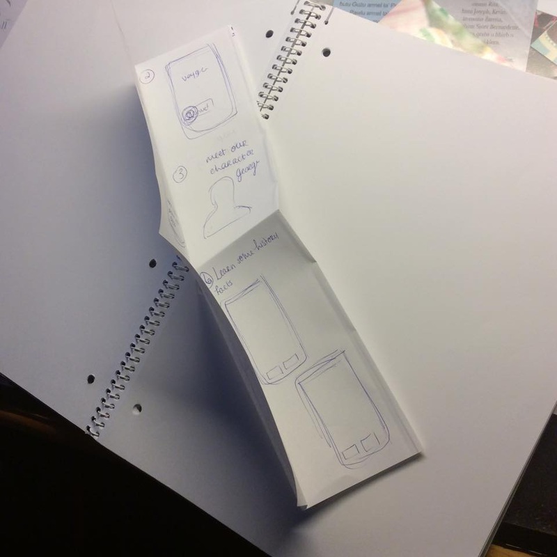 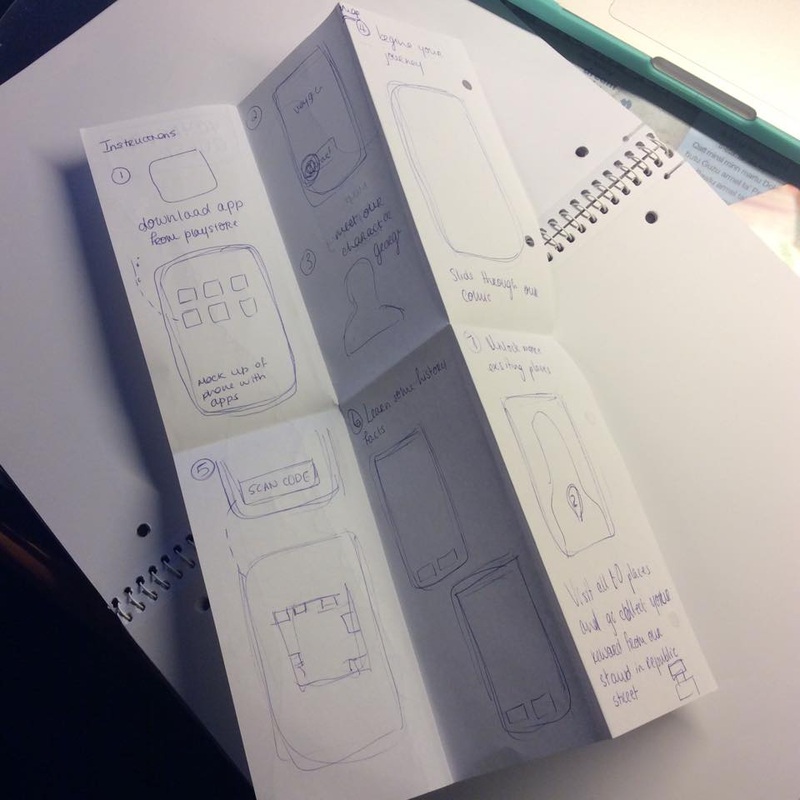 |
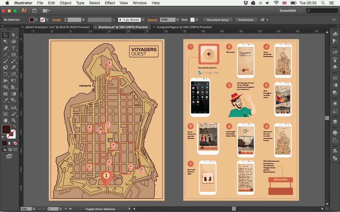
I tried to keep the design as clean as possible also I used simple graphics that would help the user understand better how the application works. I used flat designs as to keep it simple and minimalistic.
Short captions where added near each step so that the user can surely understand the process of the application he has to follow.
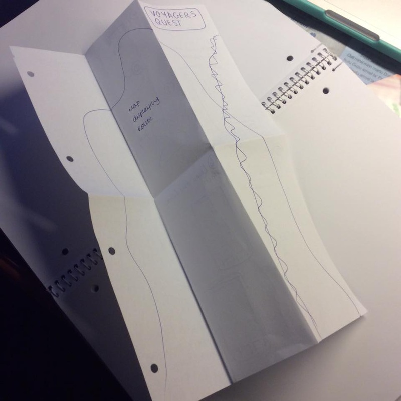
On the back side I decided to do a full image map of Valletta with the 10 places marked and the route that one has to take marked so that tourists can have a clear idea of the journey they are going to make and where are the places they are going to visit.
Short captions where added near each step so that the user can surely understand the process of the application he has to follow.
On the back side I decided to do a full image map of Valletta with the 10 places marked and the route that one has to take marked so that tourists can have a clear idea of the journey they are going to make and where are the places they are going to visit.
Design of both sides of the brochure

Lines where added to display the folds of the brochure
