This unit was very interesting as it introduced me to the concept of gamification which I had never worked on. It gave us the opportunity to work on something different and help us understand better what an app entails so that to be made possible.
After making some research about the concept of gamification, we started to brainstorm about different ideas that we could use for our project. The fact that I worked with members from the interactive media class, made me think in different ways as you have to keep in mind what is actually feasible to do to build up an application.
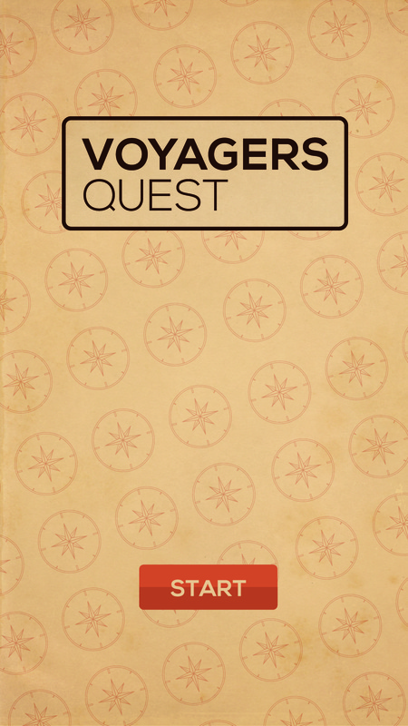
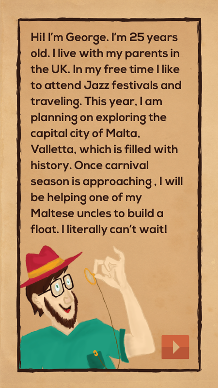
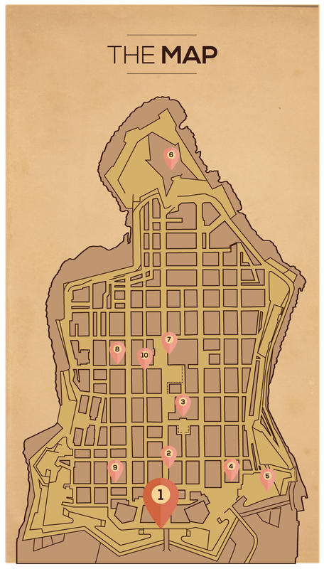
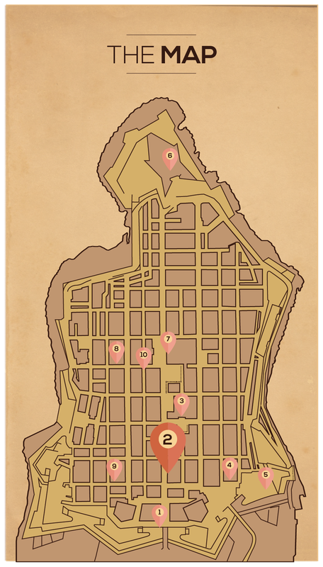
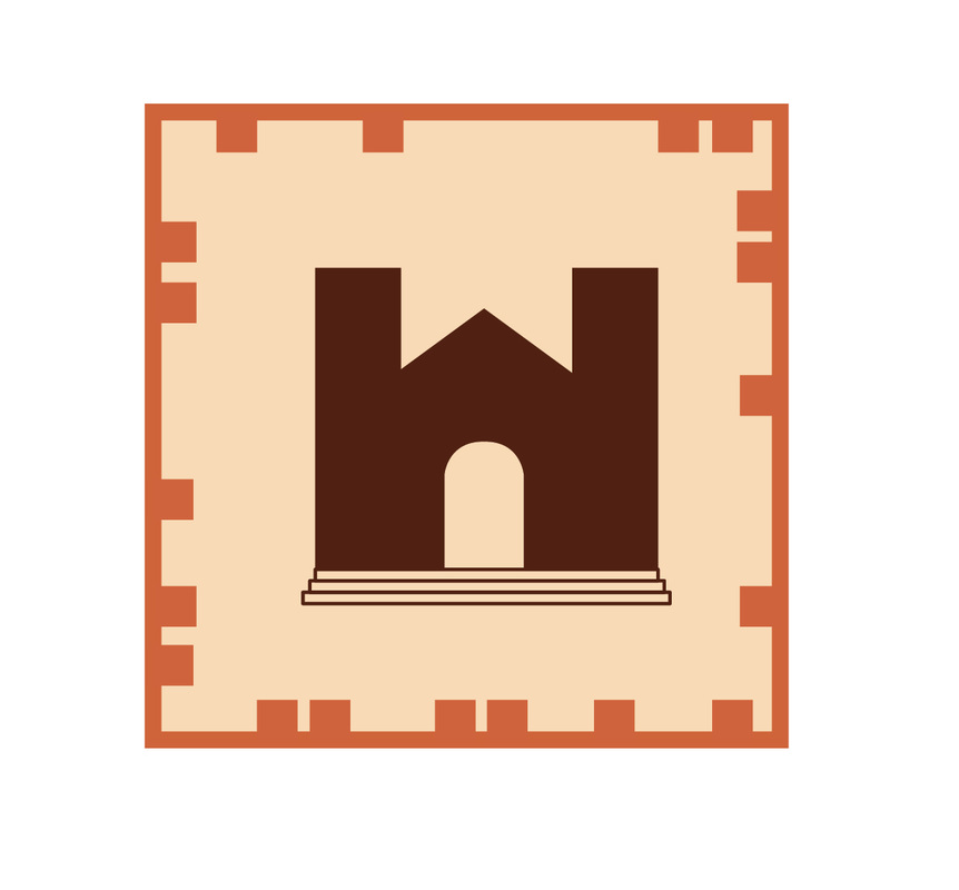
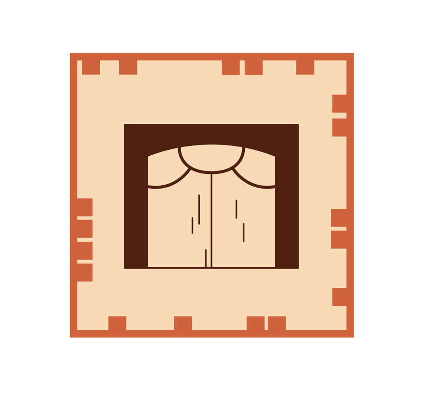
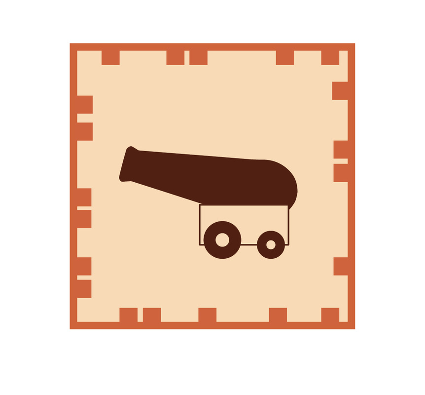
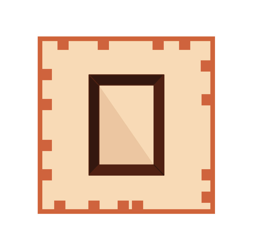
Without any hesitation we agreed to create an app for tourists based on the key places in Valletta. The app would guide the tourists through the most interesting places of Valletta while keep them entertained through a comic that continues from one place to another, and also giving them some interesting history facts about each place.
After making some research about the concept of gamification, we started to brainstorm about different ideas that we could use for our project. The fact that I worked with members from the interactive media class, made me think in different ways as you have to keep in mind what is actually feasible to do to build up an application.
Without any hesitation we agreed to create an app for tourists based on the key places in Valletta. The app would guide the tourists through the most interesting places of Valletta while keep them entertained through a comic that continues from one place to another, and also giving them some interesting history facts about each place.
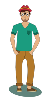 | My role at the beginning is to come up with a character that will be accompanying the tourists through this journey in Valletta. After making some research and several sketches I came up with a character with which the tourists can relate and he will be acting as a tourist himself. Next I had to create a logo for the application. Although it was a bit challenging at first as I tried to combine an icon with the text, the logo turned out quite good in my opinion as I decided that its better if the logo is text based. The fact that its text based it gives it a clean look.  |
When we presented the idea of the application to the our classmates and tutors, we had good feedback about the idea, and many told us that it is about time that history facts, which tend to be serious and boring are made more fun for tourists to enjoy. Thus, Alexia and myself started working on the idea of a narrative story (which was later transformed into a comic) so that tourists would have something to look forward to when visiting the other places. It was a good idea to include a comic in the app as it adds more humour, however, when seeing the final version of the app, the comic could have been executed better, although I like the combination of photography and illustration, it could have been combined better so as to present a more professional outcome.
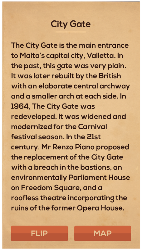
Regarding the branding we had decided that we wanted the app to have a bit of a vintage look which fits the look our capital city have, however, we wanted it to be as simple and clean as possible so that it is easy to use for the tourists. My next role was to take care of the layout design of the pages that would be included in the app. During the design process I was constantly thinking of how the user would interact with the pages so as to make it as easy as possible and also not to make it too complicated for the coder. Overall the look of the app pretty much matched the vision we had in mind when we planned the app, however, I think certain pages could have been improved further, such as the congratulations page, which was added last minute to the app. If I had to design it again I think I would take a much more infographic approach rater then include photography and hand lettering into the app, but then again it was a group work and there where different opinions about the subject matter.
Regarding the branding we had decided that we wanted the app to have a bit of a vintage look which fits the look our capital city have, however, we wanted it to be as simple and clean as possible so that it is easy to use for the tourists. My next role was to take care of the layout design of the pages that would be included in the app. During the design process I was constantly thinking of how the user would interact with the pages so as to make it as easy as possible and also not to make it too complicated for the coder. Overall the look of the app pretty much matched the vision we had in mind when we planned the app, however, I think certain pages could have been improved further, such as the congratulations page, which was added last minute to the app. If I had to design it again I think I would take a much more infographic approach rater then include photography and hand lettering into the app, but then again it was a group work and there where different opinions about the subject matter.
 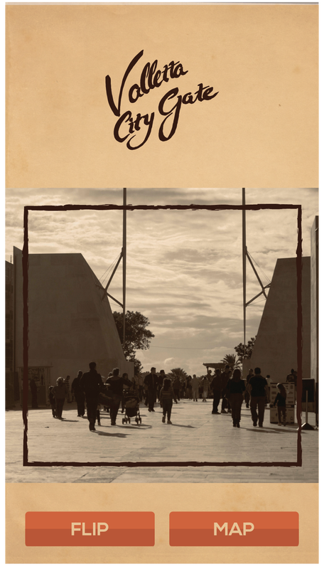 |   |   | 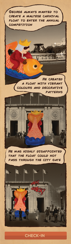 |
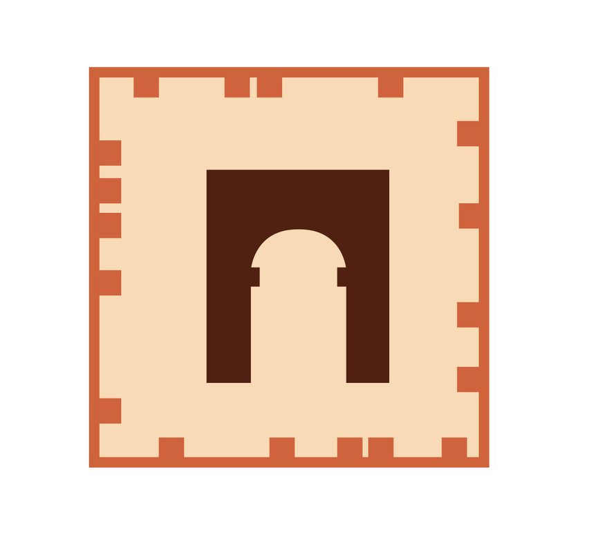
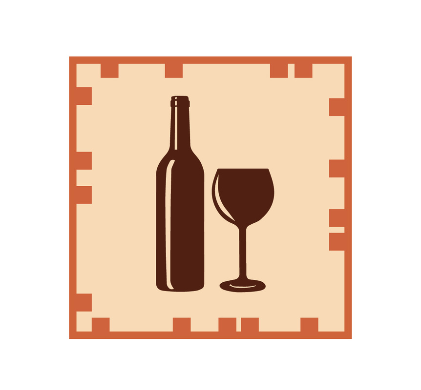
I also created the QR Code markers that the users would find on site so as to check in to a place and reveal the history facts about the place. At first I thought to keep them as minimal as possible by incorporating a graphic which shows an element from each place into a circle, however more elements needed to be added so that the QR code markers can be easily readable by the scanner.
  |   |   |   |   |
The app was programmed and coded by Anton, whom although left everything till the end managed to finish the app and make it work in time. Overall the app came pretty good, everything works as planned. One thing that I would improve, are the designs of the buttons, as they where done in Unity as well and they didn't turn out as originally designed. As for the idea of the app in general, I think that maybe other features could have been created so that to make the application more interesting, because as it is, it is pretty much straight forward and maybe it looks a bit boring. However, one must keep in mind that this will be used by tourists that are looking around Valletta, so the app basically serves as their companion to give them information whilst traveling around.
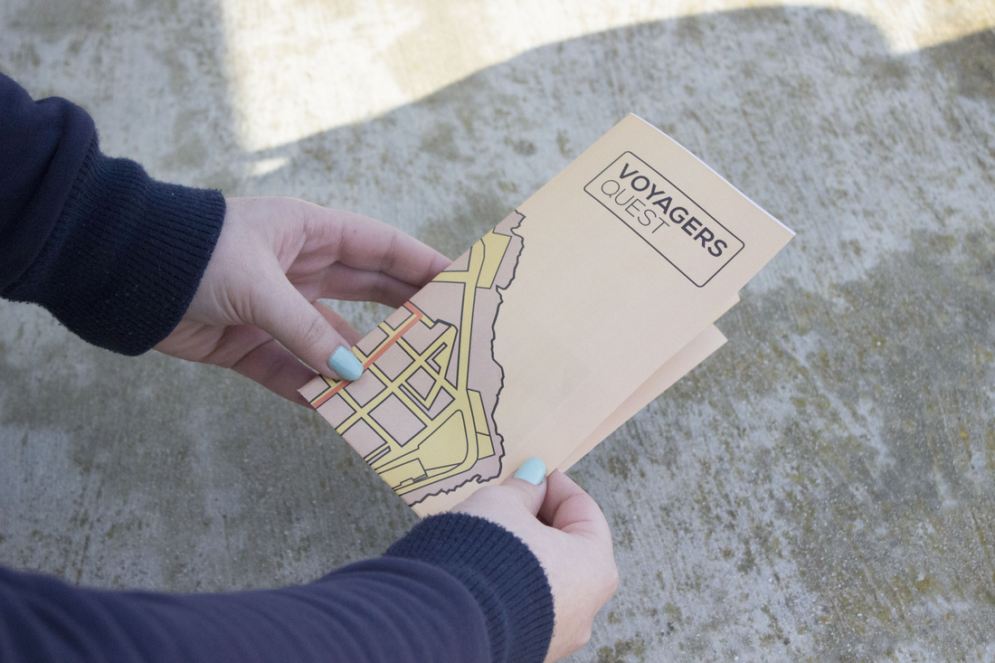
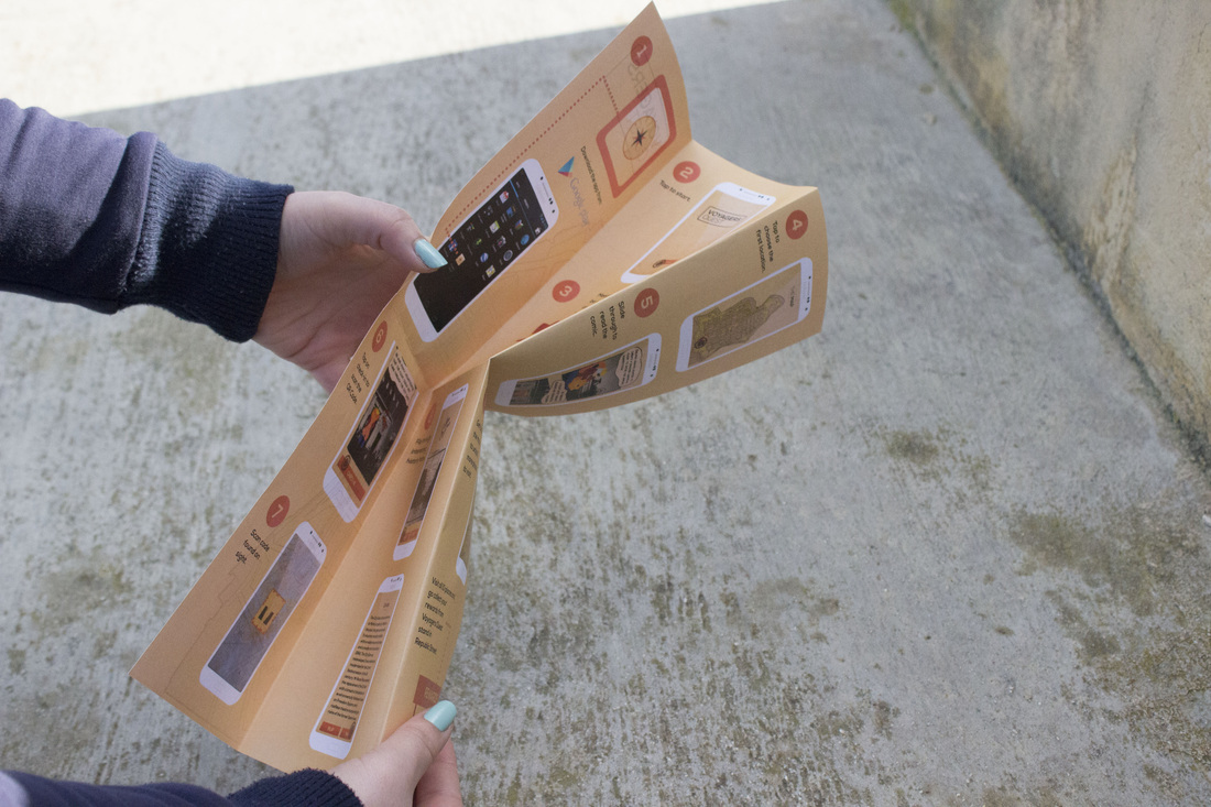
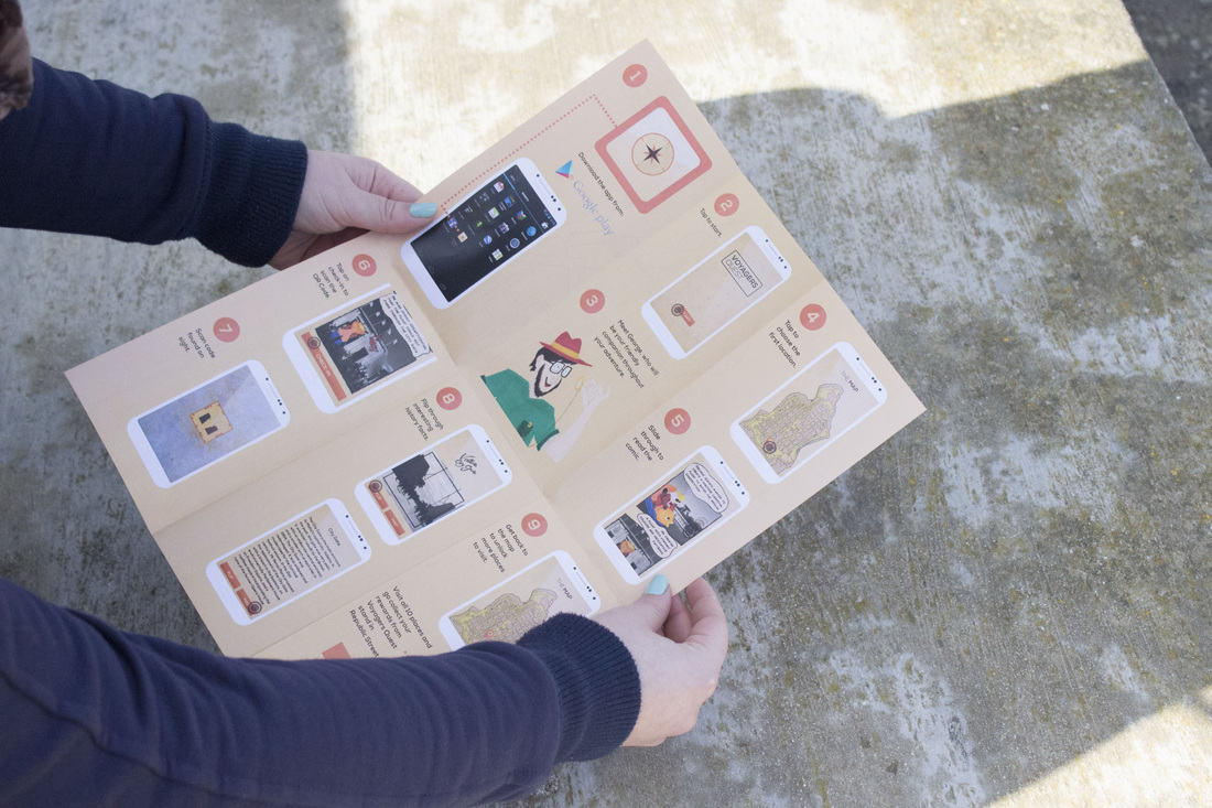
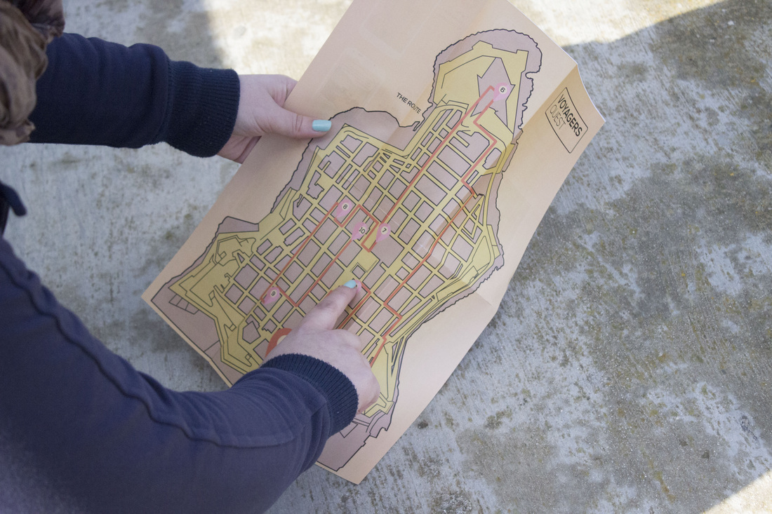
To advertise the application we thought of doing a promo which we planned out and Pippa Cutajar filmed and edited. Since we where not happy with the outcome of the promo we decided to present a brochure which serves both as a user manual of the app and also as a map displaying the route tourists are going to make around Valletta. I kept the design as simple as possible and also combined some type so that the user can truly understand how the application works. The brochure was a success in my opinion based on the feedback we gathered from our classmates.
To advertise the application we thought of doing a promo which we planned out and Pippa Cutajar filmed and edited. Since we where not happy with the outcome of the promo we decided to present a brochure which serves both as a user manual of the app and also as a map displaying the route tourists are going to make around Valletta. I kept the design as simple as possible and also combined some type so that the user can truly understand how the application works. The brochure was a success in my opinion based on the feedback we gathered from our classmates.
 |  |  |  |
I think that the workload was divided equally between the group, however sometimes we used to have some disagreements about the way forward when we would be stuck on something. Also since I am a bit of a perfectionist, in some cases I don't totally agree with how the work was executed by the others, since it doesn't look as much professional (for example the illustrated elements in the comic section could have been executed better). However, on the whole I think that we did a good job and managed to present an application with a fun factor for tourists.
